Ecommerce Category Page Content: Explain Filters, Attributes and Trade-Offs Before Product Selection
Semantic Summary
Idea A useful ecommerce category page does more than display products. It helps a shopper understand the category, narrow choices and move to the right next page.
Challenge Filters, product attributes and category copy often grow separately. The result is a page that looks busy but does not explain which choice matters or why.
Summary Build each category page around a small set of real shopper questions. Use filters for narrowing, attributes for explanation and short content blocks for the trade-offs a product grid cannot show alone.
Related Reads
- Product-Led SEO: Stop Writing for Traffic and Start Writing for Customers
- How to Write Content for AI Search
- Using NEURONwriter to Map Entity Clusters
A category page is often the place where a shopper first decides whether a store understands the product category. They may know they need a type of item, but not yet know which size, material, feature set or subcategory fits the job.
Ecommerce category page content should make that early decision easier. It should not repeat product descriptions, hide the product grid beneath a long article or turn every filter into a separate sales message.
The goal is to move a shopper from a broad category to a useful product path. Clear links also help Google understand the route from category pages to subcategories and products.
What Is Ecommerce Category Page Content?
Ecommerce category page content is the information on a category page that helps users understand a group of products before they choose an individual product. It can include a clear category name, a short introduction, subcategory links, product filters, attribute explanations, comparison criteria, useful internal links and a brief FAQ.
The content has a different job from a product description. A product page should explain one item in detail. A category page should help users decide which kind of item to investigate. That difference matters for both user experience and category page SEO. When the page answers the category-level question clearly, the product grid and filters have useful context.
Category Page vs. Product Listing Page vs. Collection Page
The terms are often mixed together. In practice, the page type should follow the shopper’s level of certainty.
| Page type | Main shopper need | Main content | Best next action |
| Category page | “Which product type should I explore?” | Subcategory choices, short context, key attributes, selected links | Choose a narrower category or product list |
| Product listing pages | “Show me products that match my criteria.” | Filterable list of products, sort controls, concise guidance | Compare individual products |
| Collection pages | “Show me a themed or temporary selection.” | Curated product group and editorial theme | Browse a campaign, occasion or use case |
| Product page | “Is this exact product right for me?” | Specifications, price, availability, proof and purchase details | Add, save or buy |
A single page can combine some of these functions. A hybrid page, for example, can show subcategory tiles above a product grid. That can work when the catalog is manageable and the visual order stays clear. The important point is to avoid making users guess whether they should browse, filter, compare or navigate deeper.
Why Category Content Must Support a Decision, Not Fill Empty Space
The best category content answers a question that a product grid cannot answer alone. A shopper might need to know whether to choose a material for durability or comfort, whether a compatibility attribute is essential, or which subcategory suits a particular use case. Generic text such as “browse our wide selection” does not help with any of these decisions.
Start with the direct answer. Explain what the category contains, who it is usually for and the first attribute worth checking. Then let the shopper browse. Longer explanations can sit lower on the page, in a clearly labelled section, where they do not delay access to products or navigation.
Start with the Shopper’s Decision, Not a Keyword List
Start with the decision the category page should support. A broad category can hide a specific uncertainty about use case, fit, material, compatibility or care.
Keyword research, search intent and search queries show what people call a category, not always what stops them from choosing. Combine them with support questions and feedback.
Identify the Category, Audience and Moment of Uncertainty
Write one practical sentence before drafting: “This page helps this shopper choose between these product paths when they are unsure about this decision.” A broad category may need subcategory guidance, while a narrow one may need help with material, compatibility or use.
Use the language customers recognise in the category name, title and H1. Long-tail search queries can guide a useful subcategory label, while internal catalog labels can confuse users and weaken navigation.
Separate Filters, Attributes and Trade-Offs
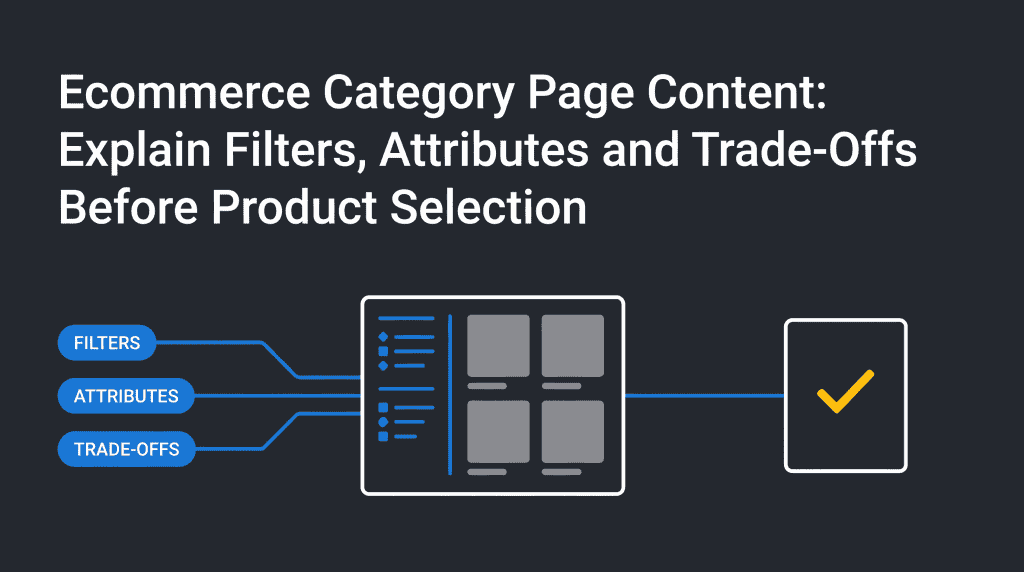
A filter is a way to narrow a set of products. An attribute is a fact about a product, such as size, material, power source, compatibility or care requirement. A trade-off explains what a shopper gains and gives up by choosing one attribute over another.
These three elements should work together. A filter might let a user choose a material. The content should explain when that material matters. The trade-off should clarify what changes with the choice: for example, durability versus weight, speed versus control, or compact size versus capacity. Without this explanation, filters can look like arbitrary menu options.
| Element | What it does | Useful category-page question | Example of helpful content |
| Filter | Narrows the visible product set | “Which options meet my basic need?” | A visible size, use-case or compatibility filter |
| Attribute | Explains a product property | “What does this option mean?” | A plain-language note about material, capacity or fit |
| Trade-off | Explains why one choice changes the outcome | “What do I gain or lose if I choose this?” | A short comparison of two suitable paths |
| Proof | Supports the explanation | “Why should I trust this guidance?” | Visible specifications, care details, availability or return information |
Use the Category Decision-Support Map
A Category Decision-Support Map links page elements to real shopper questions. Build it before changing the page: choose the three to five questions that matter most, then decide what the shopper should see, learn and do next.
| Shopper question | Useful filter or attribute | Explanation needed | Evidence source | Safe next action |
| “Which type is right for my use?” | Use case or product type | Explain the practical difference between subcategories | Product specifications and approved category rules | Open a subcategory page |
| “Will this work with what I already have?” | Compatibility | State the compatible system, size or connection clearly | Documentation and product data | Filter to compatible products |
| “Which material suits my priority?” | Material or construction | Explain durability, comfort, care or weight trade-offs | Approved product facts and care guidance | Compare a smaller product set |
| “What should I choose first?” | Best starting option or primary category | Explain the simplest path without claiming it suits everyone | Category rules and user research | Browse the primary product listing page |
| “What should I check before buying?” | Size, care, delivery or availability | Link to the exact information that changes a purchase decision | Product page and policy information | Open the relevant product page or policy page |
The map also creates a useful editorial boundary. If a fact cannot be supported by the catalog, documentation or an approved source, do not present it as a category-level recommendation. Replace a vague claim with a clear limitation or a link to the detailed source.
Decide What Belongs Above the Product Grid
The top of the page should orient users quickly: a clear H1, a short introduction and the most useful navigation or filters. Show important subcategories early, or make the grid and filters easy to find on a specific product listing page.
Keep this content short. Explain what the category contains, the first important distinction and where to start.
Keep Longer Explanations Below the Grid or in Expandable Sections
Some decisions need more detail. A shopper may need help comparing attributes, understanding care requirements or checking compatibility. Put this information below the grid, beside the relevant filter or in a clearly labelled expandable section.
This approach protects the product-listing experience while giving search engines and AI systems a structured explanation of the category. It also prevents a long content block from making a commercial page feel like a blog post with products attached.
Build the Right Category Page Type
Choose the page type based on how much the shopper already knows. A person searching a broad main category may need a navigation page. A person who has chosen a narrower product type may need a product listing page with filters. A middle category may need a hybrid page that offers both subcategory paths and a modest product grid.
When Subcategory Tiles Should Come First
Use subcategory tiles when a parent category contains distinct product types and the shopper may not know where to begin. Use recognisable labels and identifying images, not internal terms or decorative imagery.
Group many subcategories by a meaningful attribute or use case so the hierarchy stays easy to scan.
When a Filterable Product Grid Is More Useful
A filterable grid works best when users already understand the product type and need to compare available options. In this situation, the category page content should explain the filters that materially change the choice. Do not make every product field a top-level filter. Prioritise the attributes that customers use to narrow a real decision.
For example, color can matter for some categories but be secondary in others. Compatibility may be essential for a technical product category. Size may be the main decision for apparel. Let the shopper’s job determine the filter order.
When a Hybrid Page Can Work
A hybrid page can combine subcategory links and a product grid when both paths are useful and visually distinct. A shopper should see whether to choose a narrower category or compare products.
Avoid a hybrid page with an unstructured grid, promotional content, many filters and a wall of text. The next move should be clearer, not harder to interpret.
Explain Filters and Attributes Without Creating Confusion
Filters help shoppers, but URL-parameter filters can also create large numbers of crawlable combinations. Google recommends deliberate rules for which filtered URLs are useful and which should not be crawled or indexed.
The content team should identify which attributes need explanation and which combinations have real user value. The technical team can then set the URL, crawling and indexing rules.
Use Plain-Language Labels and Identifying Imagery
A filter label should mean the same thing to the shopper, the category page and the product page. If a label needs a long explanation before users understand it, consider changing the label or adding a short helper note.
Images can help users recognise a subcategory quickly, but they should identify rather than decorate. A clear product-type image often helps more than a generic lifestyle image. Consistent imagery also makes large category pages easier to scan, especially on mobile devices.
Group Filters by the Decision They Support
Put the most important filters first and group them by the decision they support. Product type and use case can define a category; material, size and compatibility can narrow a suitable product set.
Not every filter needs a separate indexable page. Create a category or subcategory only when the combination represents a stable product group with clear user demand and enough accurate content.
Treat Faceted Navigation as a User Feature and a Crawl Decision
Faceted navigation is a system of filters that changes the products a user sees. It helps users reduce a large catalog, but it can create many low-value URLs and duplicate content.
Ask whether a filtered path represents a meaningful, maintainable category. Then let the technical team decide how it should be linked, crawled and indexed.
Add Category Content That Helps Before It Sells
Category page content should clarify a purchase decision before asking for a click. Keep it concise and specific: explain the product types, relevant attributes, limits and route to further detail.
Write a Useful Category Introduction
A useful introduction gives the shopper a simple orientation: what is in this category, who is it for, which distinction matters first and where should they go next? Keep the answer near the H1 and use familiar terms.
Avoid generic marketing language. Instead of saying that the store has an excellent range, name the actual choice the page helps with. This is better for user experience, category page SEO and passage-level extraction by AI systems.
Add Comparison Criteria and Clear Limitations
When products differ in meaningful ways, state the comparison criteria. Explain what a shopper should check, not what they must buy. A category page can say that a certain attribute is useful for a particular need, while also saying when another attribute may be more suitable.
Clear limitations build trust. If compatibility depends on a detail found on the product page, link to that detail. If availability changes frequently, do not make a broad claim that may become inaccurate. Google’s documentation also stresses that product markup should match the product information visible on the page.
Link to Supporting Guides Without Replacing the Category Page
A buying guide, care guide or size guide can answer a deeper question. Link to it when the shopper needs education before comparison. The category page should still explain the immediate category decision. It should not become a collection of links that sends every visitor away before they can browse products.
Use descriptive internal links. A link such as “compare materials and care needs” tells users what they will get. A vague “read more” link does not. These links also help create a clear route between category content, guides, subcategories and individual product pages.
Ecommerce Category Page Design and SEO: Connect Category Pages to the Store
A useful ecommerce site navigation mirrors the route a shopper takes: broad category, narrower subcategory, product listing and individual product. Google recommends crawlable links through this route so pages can be found through navigation.
Use Descriptive Internal Linking and Breadcrumbs
Breadcrumbs show the category hierarchy and give users a route back. Internal linking should connect related categories only when the destination answers the next likely question.
For on-page SEO, keep category names, H1s and page titles consistent with search intent. This helps a search engine understand the page and supports organic traffic over time; it does not promise a conversion.
Keep Category Names and Page Titles Consistent
A category name, H1, page title, navigation label and product filter should not tell five different stories. Small differences create confusion for users and make content management harder. Use the same approved category language wherever possible, then document any necessary exception.
Make Mobile UX Clear Before Adding Promotions
Mobile screens make page hierarchy more important. A large banner can push subcategory links or filters below the first screen. Test the smallest screen first so the shopper can understand the category and take the next action without unnecessary scrolling.
Category Page Optimization as the Product Catalog Changes
Category page content is not finished when it is published. Review it when product attributes, availability, product groups, filters, support questions or buyer language change. A short, regular review is more reliable than a large cleanup after several years.
| Review trigger | What to check | Possible action |
| New product type or subcategory | Category hierarchy, labels and internal links | Add or revise a subcategory path |
| Changed attributes or specifications | Filter labels, explanation and product facts | Update the decision-support map |
| Repeated customer question | Missing explanation or unclear comparison criterion | Add a concise content block or FAQ answer |
| Filter produces weak or empty results | User value and technical handling | Remove, revise or escalate the filter rule |
| Category page loses clarity on mobile | Visual order, tile labels and first action | Simplify the page hierarchy |
Measure Discovery Without Claiming Direct Causation
Use a small set of signals: product clicks, high-value filter use, category searches, support questions and feedback. They can show that a page needs attention, but cannot prove that one copy change caused a conversion.
Keep a change log. Record what changed, why it changed, which category question it addressed and when the team will review the outcome. This makes category page optimisation a practical content process rather than a series of unexplained edits.
Use a Final Category Page SEO Checklist
Before publishing, check that the H1 matches the category, links are crawlable, filters solve a real decision, product listings are available, page titles reflect intent and mobile UX is clear. Ask the technical SEO owner whether structured data, page speed and canonical handling match the site’s implementation.
Ecommerce Category Page Best Practices: Common Mistakes
Treating the Category Page Like a Product Page
A category page should help a shopper choose a product path. Keep detailed specifications, price, availability and product-specific proof on the individual product page.
Making Filters More Prominent Than the Decision They Support
A long filter list can leave users unsure where to begin. Start with filters that solve the main category decision and group secondary controls clearly.
Adding Generic Text That Does Not Explain a Useful Choice
A paragraph belongs on the page only when it explains a category, attribute, trade-off, limitation or next step. Otherwise, remove it or move it to a suitable guide.
Letting Navigation, Attributes and Supporting Content Contradict Each Other
A category description may say one thing while the filter labels, product data or support pages say another. This creates a poor user experience and weakens trust. Give one owner responsibility for the approved category language and review connected pages when a definition changes.
How NEURONwriter Supports Category Page Content Updates
NEURONwriter can help a team research the questions users ask, create a brief, organise a content update and keep category terminology consistent across related pages. Use it after the team has verified catalog facts, the shopper question and the category hierarchy.
It does not replace product information, user research or technical ownership of filters and URLs. A useful workflow is simple: map the shopper decision, approve the facts, update the category content, review linked pages and record what changed.
Frequently Asked Questions About Ecommerce Category Page Content
What is ecommerce category page content?
Ecommerce category page content is the information that helps a shopper understand a product group before selecting an actual product. It can include a clear category description, subcategory links, filter explanations, attribute guidance, internal links and short answers to common questions.
What is the difference between a category page and a product listing page?
A category page usually helps users choose a product type or subcategory. A product listing page usually shows products in a narrower group and lets users filter or sort them. Some stores use a hybrid page, but the navigation and browsing roles should remain clear.
How much content should an ecommerce category page have?
Use enough content to explain the category, important attributes and the next decision. There is no useful fixed word count. Short, specific content that answers a real question is better than a long block of generic text.
Should filters appear on every category page?
No. Filters should appear when they help users narrow a real product choice. A broad navigation category may work better with subcategory tiles, while a specific product listing page often needs filters for attributes such as size, use case or compatibility.
Should every filter create a separate search page?
No. Many filter combinations are useful only inside the browsing experience. Give a separate category or subcategory page to a filter combination only when it represents a stable, useful product group with clear user demand and enough accurate content.
Where should category page content appear?
Put a short orientation near the top, close to the H1 and primary navigation. Place longer explanations, comparison criteria and FAQs lower on the page or in expandable sections so they do not delay access to products.
Do category pages need internal links?
Yes, when the links help users continue their journey. Link to relevant subcategories, adjacent categories, supporting guides and product pages. Use descriptive anchor text and keep the route consistent with the site hierarchy.
How often should category page content be updated?
Review it whenever the catalog, product attributes, filter choices or customer questions change. A monthly light review for priority categories can catch outdated labels and missing guidance before they become a larger problem.
Can category page content help AI search systems understand a store?
Clear headings, direct explanations, descriptive links and accurate facts help people and search systems understand ecommerce websites. They can make a category easier to interpret in search engine results, but the goal remains clear product decisions for people first.