
Designing Content for Readability: Formatting Tips That Keep Users on Page
Semantic Summary
Idea: In 2026, SEO is not just about getting users to click your link; it is about keeping them on the page. Search engines use behavioral signals like dwell time and scroll depth to determine if your content truly satisfies the query. Even the most semantically rich article will fail if it is visually exhausting to read.
Challenge: Many content creators treat writing and design as separate disciplines. They produce massive “walls of text” that cause cognitive overload, leading to high bounce rates and pogo-sticking. When users immediately return to the search results, Google’s NavBoost system registers a negative signal, inevitably dragging down your rankings.
Summary: Readability is a critical UX and SEO factor. By implementing strategic formatting such as generous whitespace, short paragraphs, clear hierarchical headings, and scannable lists you can significantly increase comprehension and dwell time. Using NEURONwriter to structure your content ensures it is both semantically optimized for AI and visually digestible for human readers.
Related reads:
The Impact of User Behavior Metrics on 2026 Search Rankings
The End of Commodity Content: Why High-Friction SEO is the Only Way to Win in 2026
The Hidden Cost of the “Wall of Text”
You have spent hours researching a topic, optimizing entities, and crafting the perfect comprehensive guide. It ranks well initially, but within a few weeks, it begins to slide down the SERPs. Why? Because when users click on it, they are greeted by a dense, unbroken block of text. They immediately feel overwhelmed and hit the “back” button.
In the SEO landscape of 2026, user behavior metrics are the ultimate arbiter of content quality. If your formatting causes cognitive friction, your dwell time will plummet, and your rankings will follow. Readability is no longer just a design concern; it is a fundamental pillar of semantic SEO.
When users arrive at a webpage, they do not read linearly like a book. They scan. They look for visual anchors headings, bold text, and bullet points to determine if the page contains the answer they need. If those anchors are missing, the perceived effort of reading becomes too high, and the user bounces .
Data-Backed Formatting Rules for 2026
Improving content readability requires a deliberate approach to typography, layout, and structure. Here are the data-backed formatting strategies that keep users engaged and scrolling.
The Power of Macro and Micro Whitespace
Whitespace (or negative space) is the empty area between design elements. It is arguably the most powerful tool for improving readability and reducing cognitive load.
- Micro Whitespace: This refers to the space between lines of text (line height) and between paragraphs. Increasing line height (typically to 1.5 or 1.6) makes text significantly easier to track, especially on mobile devices.
- Macro Whitespace: This is the larger space between major sections, margins, and images. Generous macro whitespace guides the user’s eye down the page and provides necessary visual “breathing room.”
Research indicates that good use of whitespace between paragraphs and in the left and right margins can increase comprehension by almost 20%. Furthermore, studies show that users overwhelmingly prefer layouts with ample whitespace, as it makes the content feel more approachable and less intimidating.
Optimal Paragraph and Sentence Length
The days of long, academic paragraphs are over. Online reading requires brevity.
To maintain engagement, paragraphs should rarely exceed three to four sentences. Even single-sentence paragraphs are highly effective for emphasizing key points and creating visual breaks. Short paragraphs create more micro whitespace, making the text feel less dense and encouraging the user to keep reading.
Similarly, aim for shorter sentences. Complex, multi-clause sentences force the reader to work harder to extract meaning. A good rule of thumb is to keep the majority of your sentences under 20 words. Tools that measure the Flesch Reading Ease score often recommend aiming for a 7th to 8th-grade reading level to maximize accessibility.
Hierarchical and Descriptive Headings
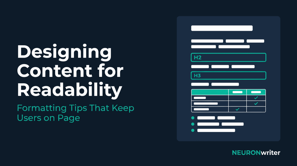
Headings (H2, H3, H4) serve two critical functions: they provide structure for search engine crawlers and act as signposts for human scanners.
A common mistake is using clever or vague headings. Instead, headings should be highly descriptive, summarizing the exact value of the section below them. If a user only reads your headings, they should still understand the core narrative of the article.
NEURONwriter excels at helping you build this structure. By analyzing top-ranking competitors, it suggests semantically relevant terms to include in your headings, ensuring your content architecture aligns with both user intent and search engine expectations.
Typography: Size and Contrast Matter
Font size directly impacts the perceived length and difficulty of an article. If the font is too small, the user has to strain, increasing fatigue.
- Font Size: For body text, 16px should be considered the absolute minimum, with 18px to 20px becoming the standard for modern, readable blogs.
- Contrast: Ensure high contrast between the text and the background. Dark gray text (e.g., #333333) on a white or very light gray background offers optimal readability without the harsh glare of pure black on pure white.
The Readability vs. Engagement Matrix
To understand how different formatting choices impact user behavior, consider the following data comparing traditional dense formatting with optimized readability practices.
| Formatting Element | Traditional “Wall of Text” | Optimized for Readability | Impact on User Behavior |
| Paragraph Length | 5-8 sentences | 1-4 sentences | Reduces cognitive load; increases scroll depth. |
| Line Height | 1.2 or lower | 1.5 to 1.6 | Improves tracking; prevents losing place in text. |
| Font Size (Body) | 12px – 14px | 16px – 18px+ | Prevents eye strain; crucial for mobile users. |
| Visual Anchors | Rare (mostly text) | Frequent (bolding, lists, callouts) | Facilitates scanning; helps users find answers faster. |
| Average Dwell Time | Often < 30 seconds | 2+ minutes | Sends strong positive signals to Google’s NavBoost. |
Designing for the Mobile-First Reality
Over 60% of web traffic is mobile, meaning your formatting must be optimized for small screens first. A paragraph that looks reasonable on a desktop monitor can easily fill an entire smartphone screen, instantly creating a wall of text.
When designing for mobile: * Keep margins wide enough to prevent text from touching the edges of the screen. * Ensure tap targets (links and buttons) are large enough and spaced far enough apart. * Use images and graphics strategically to break up text, but ensure they are optimized for fast loading to protect your Core Web Vitals.
Why NEURONwriter is the Ultimate Formatting Assistant
Creating readable content is not just about aesthetics; it is about semantic structure. NEURONwriter goes beyond basic keyword suggestions by helping you architect your content for maximum readability and engagement.
While other tools might just give you a list of words to stuff into a paragraph, NEURONwriter intuitive document editor encourages you to build logical hierarchies using H2 and H3 tags. It helps you identify exactly where to place semantic entities to answer user questions quickly and clearly. By using NEURONwriter to outline and draft your content, you naturally create highly structured, scannable articles that satisfy both the user’s intent and Google’s behavioral algorithms.
Conclusion: Readability is SEO
You cannot separate content quality from content presentation. If your formatting drives users away, your brilliant insights and semantic optimization will never see the light of day. By prioritizing macro and micro whitespace, utilizing descriptive headings, and keeping paragraphs short, you create an environment where users want to stay. In 2026, keeping the user on the page is the most powerful SEO strategy you have.
FAQ: Content Readability and SEO in 2026
Does readability directly impact Google rankings?
While Google does not use a specific “readability score” (like Flesch-Kincaid) as a direct ranking factor, readability heavily influences user behavior metrics like dwell time and bounce rate. Content that is easy to read keeps users on the page longer, which sends strong positive signals to Google’s NavBoost system, indirectly boosting rankings.
What is the ideal paragraph length for online content?
For optimal online readability, paragraphs should generally be kept to 1-4 sentences. Short paragraphs create micro whitespace, making the text easier to scan and less intimidating, especially on mobile devices.
How does whitespace improve conversion rates?
Whitespace reduces cognitive overload and helps guide the user’s attention to key elements, such as Call-to-Action (CTA) buttons or important information. By removing clutter, whitespace allows the main message to stand out, leading to higher comprehension and conversion rates.
What is the difference between macro and micro whitespace?
Micro whitespace refers to the small spaces between elements, such as line height (spacing between lines of text) and letter spacing. Macro whitespace is the larger empty space between major layout elements, such as margins, padding around sections, and the space between a heading and the following paragraph.
What is the minimum recommended font size for blog posts?
In 2026, 16px is considered the absolute minimum for body text readability on the web, though many modern sites use 18px or even 20px. Larger fonts prevent eye strain and improve the reading experience across all devices.
Why is scannability important for SEO?
Users rarely read web pages word-for-word; they scan to find specific answers. If a page lacks visual anchors like descriptive headings, bulleted lists, and bold text, users will struggle to find what they need and will likely bounce back to the search results (pogo-sticking), which harms your SEO.
How can NEURONwriter help improve content structure?
NEURONwriter helps you build a logical content hierarchy by suggesting semantically relevant terms for your H2 and H3 headings based on top-ranking competitors. This ensures your article is not only rich in entities but also structured in a way that is highly scannable and easy for users to digest.